Minnesota Logo Designers
Custom Business Logo Design
Partner with an affordable graphic design agency, backed by a team of experts.

Bringing ideas from pen and paper to digital vector.
Watermark Design is a leading design company in MN that offers graphic design and logo design.
MN Logo Design
Our business is built on relationships. We want you to succeed and will NOT pitch you something to make a sale. We partner with you, educate, and walk side by side with you in the development of your logo design. This is why many of our clients keep coming back over and over again for the last 10+ years.
We provide top logo design & branding to start-ups, small businesses, churches and nonprofits through clarifying your design message, positioning your client as the hero.
We love working with the curious, the novices, the outdated, the little guys, the mom and pop shops, the entrepreneurs and the up-and-comers. We are designers that care and love challenges.
If you’re ready to move forward please fill out this detailed form which asks for a little more information on the logo.
Some questions we ask are; business name, color preferences, type face, logo will used on, imagery in mind, describe your services, etc.
Get A Logo Quote
MN Logo Design Services
Logo design project manager
Our professional logo design steps
1. Kickoff & creative brief
We dive in learning about your business, brand, target audience and competitors. We work together to build a project overview, provide a project timeline and what we will need from you.
2. Research & Sketching
Our design team starts developing concepts with pen and paper with sketchs and/or on the computer.
3. Develop digitally & presentation
Our design team reviews the logo sketchs, files and narrows down the best 3-4 ideas to present to the client.
4. Revise
From the group of logos, we narrow down to the top two. Then explore options for those, while working from the clients feedback.
5. Final logo
The agreed-upon logo is sent to you in formats for print and web (ie vector, ai, eps, jpg, png and pdf files). You own all rights upon completion. More details on logo variations.
Digital & Print Logo Design Variations, File Types & Sizes
Logo Variations
- Vertical / Square logo – stacked style. Good for signage, collateral pieces. Sizes: 1080px (L 100%, M 50%, S 10%)
- Horizontal logo – best for websites. Sizes: 1920px (L 100%, M 50%, S 10%)
- Brandmark / Icon – without text. Good for social media accounts and apparel. Sizes: 1080px (L 100%, M 50%, S 10%)
- Wordmark – text only. Good for limited space areas. Sizes: 1920px (L 100%, M 50%, S 10%)

Vertical Logo Design: Make a Bold Statement
A vertical logo design is an excellent choice if you want to make a bold statement and emphasize your brand’s name. By stacking your logo elements vertically, you create a sleek and eye-catching design. This layout is particularly useful for businesses with long or text-heavy names.
Vertical logos work wonders on websites, social media profiles, and even business cards. They provide a compact and versatile design that easily adapts to different platforms. Want to make a strong visual impact? Go for a vertical logo design!
Horizontal Logo: Versatile and Engaging
When it comes to versatility, the horizontal logo is a winner. This layout offers a wider canvas to showcase your brand’s name, symbol, or both, making it perfect for websites, banners, and signage. The horizontal format allows for a more spacious and engaging design.
The elongated shape of a horizontal logo provides ample space for creative elements, such as taglines or graphics, alongside your brand identity. This layout ensures that your logo remains prominent while seamlessly integrating with different marketing materials. Maximize your brand’s visibility and impact with a captivating horizontal logo.
Logomark: Simplify and Symbolize
Sometimes, less is more. Enter the logomark, a simple yet powerful logo layout that relies on a single symbol or icon to represent your brand. By distilling your brand’s essence into a visually appealing symbol, you create a logo that is instantly recognizable and memorable.
Logomarks excel in digital spaces, such as social media profiles and mobile apps, where simplicity and clarity are key. They are also effective for global brands with multilingual audiences, as they transcend language barriers. Simplify your brand’s identity with a striking logomark that captures attention and leaves a lasting impression.
Wordmark: Typography That Speaks Volumes
If your brand’s name is distinctive and has a strong visual appeal, a wordmark logo might be the perfect choice. Wordmarks rely on typography to convey your brand’s identity. By selecting a unique font and arranging the letters in a visually pleasing way, you create a logo that speaks volumes.
Wordmarks are ideal for businesses that want to establish a strong brand presence. From Nike to Coca-Cola, many successful companies have embraced the power of typography to create instantly recognizable logos. Let your brand’s name take center stage with a captivating wordmark that exudes style and personality.
Ready to Make a Lasting Impression?
Now that you’ve explored the various logo design layout variations, it’s time to take action. Create a logo that reflects your brand’s identity, captivates your audience, and sets you apart from the competition. Whether you choose a vertical, square, horizontal logo, logomark, or wordmark, make sure it speaks to your target audience and represents your brand values. Get started today and leave a lasting
Color Variations
Unlock the Full Potential of Your Logo: The Importance of File Types for All Four Color Variations
When finalizing your logo design, having dedicated file types for all four color variations—Full Color, Inverse, Black, and White—can significantly impact your brand’s versatility and visual consistency. Each color variation serves a unique purpose, from showcasing vibrancy and capturing attention to ensuring legibility on different backgrounds. By having separate file types for each variation, you empower your brand to make a bold statement, adapt seamlessly across various platforms, and maintain a cohesive visual identity.
- Full Color – usually 2 colors, a black wordmark on white background.
- Inverse – a black wordmark changed to a white wordmark, and on a dark background.
- Black – all black format on white background.
- White – all white format on black background.

Full Color: Bursting with Vibrancy and Personality
The full-color version of your logo is where your brand truly comes alive. It utilizes a rich palette of colors that reflects your brand’s personality, values, and overall vibe. By incorporating multiple hues, you can create a visually striking logo that grabs attention and leaves a lasting impression. Whether you opt for a bold and energetic design or a more serene and sophisticated one, the full-color variation allows you to express your brand’s identity in all its glory.
Now, it’s time to unleash your creativity and experiment with various color combinations to find the perfect blend that represents your brand. Remember to maintain harmony and balance between the different elements, ensuring they work together seamlessly to create an impactful logo.
Inverse: Embrace the Power of Contrast
The inverse color variation is all about flipping the script and playing with contrasts. By reversing the colors of your logo, you can create a striking and eye-catching effect. This variation is particularly useful when placing your logo on backgrounds that clash with your full-color version.
When designing the inverse variation, consider the negative space and how it interacts with the logo elements. Make sure the logo remains legible and recognizable, even with the color switch. Test different background colors and patterns to find the ideal combination that enhances visibility and maintains the brand’s aesthetic appeal.
Black: Sleek, Timeless, and Elegant
Simplicity and elegance are beautifully captured in the black color variation of your logo. By stripping away the hues and embracing the power of black, you create a sophisticated and timeless design. This variation is perfect for situations where color reproduction might be limited, such as black and white publications or grayscale printing.
Designing a black logo requires careful attention to detail. Ensure that the logo elements maintain their shape and are clearly defined against the black background. Keep in mind that even without color, your logo should convey the essence of your brand and remain easily recognizable.
White: Pure, Clean, and Versatile
The white color variation of your logo offers a clean and versatile option that can be adapted to various backgrounds. Whether it’s a colorful image, a vibrant pattern, or a dark background, the white variation ensures your logo remains visible and legible, while seamlessly blending with its surroundings.
When creating the white logo variation, focus on simplicity and clarity. Opt for clean lines and solid shapes that stand out against the background without any color distractions. Remember, white can be a powerful choice that signifies purity, simplicity, and a fresh start.
Take the Next Step: Perfect Your Logo Design
Now that you’ve discovered the importance of logo design color variations, it’s time to put this knowledge into action. Whether you’re a business owner, a designer, or an aspiring entrepreneur, unlocking the full potential of your logo is within your reach.
Explore different color combinations, experiment with contrasts, and fine-tune your logo until it reflects your brand’s essence. Don’t be afraid to seek feedback from your audience and make adjustments along the way. Remember, a well-designed logo, with carefully considered color variations, can become the cornerstone of your brand identity.
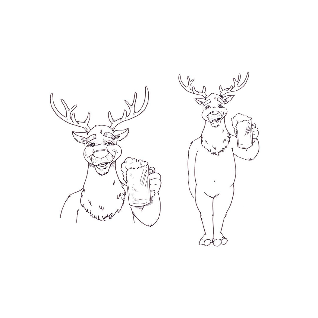
Caricature Design, Text Logo, Crest Logo
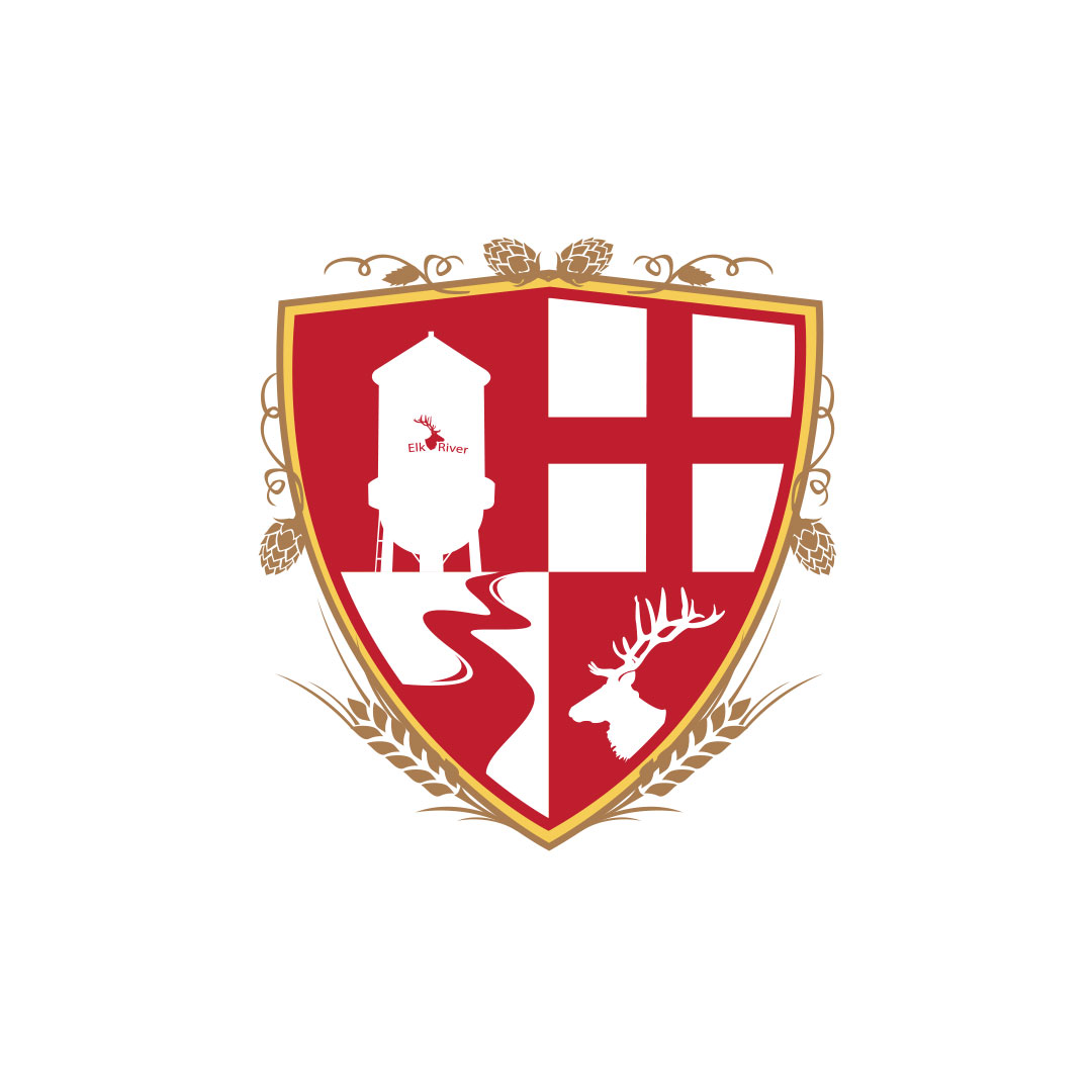
Logo design brought to life for a local brewery.


Lets get started!
Contact Us
Use the form below to contact us. We look forward to learning more about you, your organization, and how we can help you be more successful.
Explore our blog for design
advice and inspiration
6 Ways for Leveraging SEO Platforms to Boost Organic Rankings
Struggling to be seen online in Minneapolis? You're not alone. Minnesota businesses rely heavily on organic search ranking...
How to Optimize Google Business Profile for Enhanced Sales?
In today's digital age, having a strong online presence is no longer a luxury - it's a necessity. Customers are...
Revolutionize Your Minneapolis Business with Custom Web Design Strategies
In today's digital era, the significance of custom web design in distinguishing businesses within the competitive online...

